Sherwin-Williams Universal Khaki (SW 6150) is a warm neutral paint color with earthy beige-khaki undertones. It is popular because it can feel cozy and market-friendly without looking flat when you pair it with the right trim and lighting.
If you are choosing Universal Khaki paint by Sherwin-Williams, the biggest questions are usually the same: what undertones it has, which white trim works best, and whether it will read muddy, yellow, or grounded in your light.
At a glance
| Topic | Quick answer |
|---|---|
| Undertone | Warm beige-khaki with a muted earthy cast |
| Best rooms | Living rooms, bedrooms, hallways, and warm neutral main spaces |
| Best trim direction | Crisp white for contrast or soft white for a blended look |
| Main risk | Can look too tan or muddy in low light or next to very warm finishes |
This guide breaks down undertones, best rooms, and practical pairings so you can choose confidently.
Quick facts (at-a-glance)
What Universal Khaki is (warm neutral)
Universal Khaki (SW 6150) is best thought of as a warm neutral that sits in the beige/khaki family with a soft, muted feel. It’s often chosen when you want warmth without going “tan-orange,” and when you want a color that plays nicely with a lot of fixed finishes.
Best uses (rooms + lighting)
Below is a practical cheat sheet for where Universal Khaki tends to perform best.
| Space | Best lighting condition | What you’ll see | Recommended sheen |
|---|---|---|---|
| Living room / family room | Mixed daylight, balanced bulbs | Cozy, grounded warm neutral | Eggshell (walls), satin (trim) |
| Hallways | Low to medium natural light | Can deepen; looks sophisticated | Eggshell |
| Bedrooms | East or south light | Warm and calming | Eggshell |
| Open concept main floor | Good natural light + consistent bulbs | Cohesive warm backdrop | Eggshell |
| Bathrooms | Bright light, cooler tile | Warms up hard surfaces | Satin (for moisture resistance) |
| Kitchens (walls) | Medium to bright light | Warm backdrop for cabinets | Eggshell (walls), satin/semigloss (trim) |
What it looks like next to common whites/woods
- Next to crisp whites (bright, cool-leaning whites): Universal Khaki can look more “khaki/greige” and slightly deeper.
- Next to soft whites (warm whites): it reads smoother and more blended—less contrast, more warmth.
- With oak (especially golden oak): the whole scheme warms up quickly; choose a cleaner trim white to prevent “too tan.”
- With walnut or dark-stained floors: Universal Khaki can feel modern and rich, especially with black accents.
Universal Khaki undertones explained
Is it beige, greige, or khaki?
Universal Khaki typically reads as a beige-leaning khaki with a muted, slightly earthy cast. If you’re comparing categories:
- Beige: yes—warm and approachable.
- Greige: sometimes—especially in cooler light or next to very warm finishes.
- Khaki: yes—more “earthy” than a creamy beige, less pink than some classic beiges.
If you want “definitely greige,” Universal Khaki may read a bit warmer than you expect. If you want “definitely beige,” it may read a touch more subdued/earthy than a creamy tan.
How lighting changes Universal Khaki
Light direction is often the difference between “perfect neutral” and “why does this look different than the swatch?”
- North-facing rooms (cooler, flatter light): Universal Khaki can look more muted and slightly deeper. This is where people sometimes describe it as leaning more “greige.”
- South-facing rooms (warm, bright light): it looks warmer and more classic khaki-beige. You’ll get more of the cozy warmth.
- East-facing rooms: warmer in the morning, calmer and more neutral later.
- West-facing rooms: can intensify warmth late in the day—use consistent 2700K–3000K bulbs if you want predictable results.
How artificial light changes it
Artificial lighting can shift Universal Khaki just as much as daylight direction.
- Very warm bulbs can pull out more yellow and make the color feel heavier.
- Neutral or balanced bulbs tend to keep the paint grounded and easier to read.
- Mixed bulbs in open-plan spaces can make the same wall look inconsistent from one zone to another.
If you are testing samples, turn on the lights you actually use at night before deciding.
Why trim and flooring shift the read
Universal Khaki does not exist in isolation. It changes next to:
- bright trim whites
- creamy whites
- golden oak
- gray tile
- dark flooring
That is why a sample that looked calm on a chip can feel muddy or richer once it is surrounded by the real room.
Common ‘surprise’ undertones to watch for
In real rooms, “surprise” undertones tend to show up due to nearby finishes and reflections.
Watch for:
- A subtle yellow warmth when paired with warm lighting or golden woods.
- A slightly greenish/earthy cast when surrounded by cool grays, some stone/tile, or lots of greenery reflecting in.
- Muddiness in low light, especially if the room has very warm bulbs and little daylight.
Tip: test on two walls (one in the brightest light, one in the dimmest) before committing.
Best coordinating trim and white paints
Crisp whites vs soft whites
If you want Universal Khaki to look clean and intentional, pick your trim white based on the amount of contrast you want.
Best coordinating whites (general guidance):
- For a crisp, updated look: choose a cleaner white (less creamy) to sharpen edges and reduce “all-over tan.”
- For a softer, blended look: choose a warm white (a bit creamier) so the transition feels gentle.
Quick rule:
- Lots of warm finishes (oak, beige tile, warm countertops)? Go crisper on trim.
- Lots of cool finishes (gray tile, cooler stone)? Go softer on trim to keep walls from looking too drab.
Trim sheen recommendations
- Trim: satin is the safest “modern default” (easy to wipe, not too shiny).
- Doors: satin; go semi-gloss only if you want a more traditional, high-contrast look.
- Baseboards in high-traffic homes: satin for durability and touch-ups.
Keep sheen consistent across all trim for a cohesive result—especially important for listings.
Ceiling color guidance
- Most homes: use a flat ceiling white to keep the room bright and reduce shadows.
- If the room is already dim: a brighter ceiling white helps prevent Universal Khaki from feeling heavy.
- If you have lots of warm light at night: avoid an overly creamy ceiling white; it can amplify warmth and make walls feel more yellow.
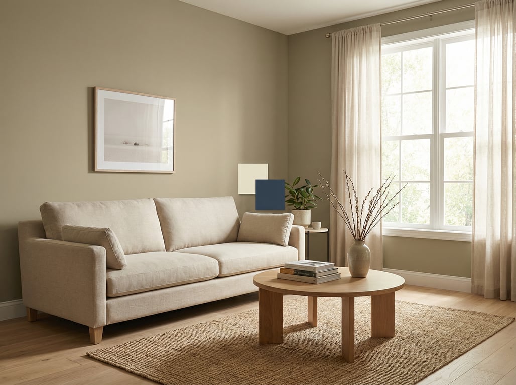
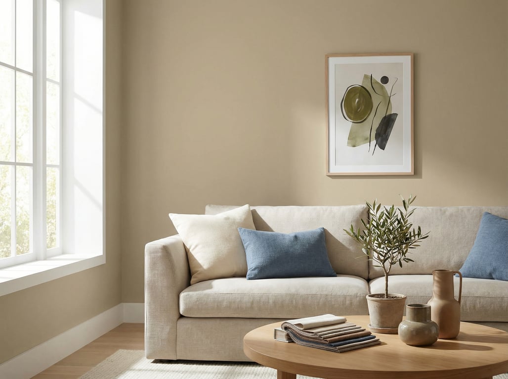
Coordinating accent colors and materials
Blues/greens that balance the warmth
Universal Khaki likes cool-leaning accents to balance its warmth.
Try:
- Dusty blue accents (pillows, art, rug) for a calm complementary feel.
- Sage/olive greens for an earthy palette (works especially well with wood tones).
- Deep navy for a sharper, higher-end contrast in staging.
Practical tip: If the walls feel too warm, introduce blue-gray textiles and white/ivory upholstery to neutralize the overall read.
Hardware metals (black, brass, nickel)
- Matte black: modern, defined contrast (great for photos and listings).
- Brass / champagne bronze: enhances warmth; use when you want cozy and elevated.
- Nickel / chrome: keeps things crisp; helpful if the room risks skewing too warm.
Flooring: oak, walnut, tile, carpet
- Oak (golden or red oak): choose cooler accents and a cleaner trim white to keep it from turning too yellow.
- Walnut / dark wood: creates a rich, sophisticated scheme; add lighter rugs to keep it airy.
- Gray tile: Universal Khaki can soften the coolness—add warm metals or wood to bridge.
- Beige carpet: watch “same-value” blending; increase contrast with brighter trim and layered whites.
Universal Khaki vs similar Sherwin-Williams colors
How to avoid picking the wrong ‘close match’
Close neutrals can look identical on a chip and totally different at full scale. To avoid the wrong “almost the same” pick:
- Compare at the same time of day (morning and evening).
- Hold samples against your fixed finishes (flooring, countertops, tile).
- Use a big sample area (at least 12" x 12" or larger), not a tiny swatch.
- Check it next to your trim white—undertones show up at the boundary.
When to choose a lighter/darker alternative
Choose a lighter alternative if:
- the room is north-facing or naturally dim,
- you have dark floors/cabinetry and want more brightness,
- you’re staging a smaller space and want it to feel larger.
Choose a darker alternative if:
- you want more drama and contrast with bright white trim,
- the space gets intense sun and lighter colors look washed out,
- you’re aiming for a more “designer neutral” feel.
If you’re on the fence, prioritize how it looks in the worst light in the room (the darkest corner). That’s where disappointment usually shows up.
Choose this color vs a lighter or cleaner neutral
Choose Universal Khaki if you want:
- more warmth than a cool greige
- an earthy, grounded neutral
- a color that works with wood-heavy interiors
Choose a lighter or cleaner neutral if you want:
- a brighter small room
- less risk of muddiness in low light
- a cooler overall palette with crisp finishes
Tips for using it in real-estate listings and staging
Why warm neutrals photograph well
Warm neutrals like Universal Khaki tend to:
- make spaces feel inviting (especially in living areas),
- reduce the sterile look that some cool grays create,
- pair well with common buyer-friendly materials (wood, black accents, natural textiles).
For faster decision-making, many sellers and agents use AI decorating apps for quick room mockups to preview furniture, rugs, and accent colors against warm-neutral walls.
How to keep it from looking muddy in photos
“Muddy” usually comes from low light + warm bulbs + low contrast styling.
Use this photo/staging checklist:
- Lighting: aim for consistent bulbs (2700K–3000K) and turn on all lights for interior shots.
- Contrast: add brighter whites (trim, bedding, towels) and a few darker anchors (black frames, hardware).
- Edit exposure carefully: over-brightening can shift warm neutrals yellow.
- Simplify the palette: too many warm tones (tan rug + tan sofa + tan curtains) can flatten the room.
If the home is vacant or you need multiple style options fast, virtual home staging with AI can help you test cooler accent colors (blues/greens) that keep Universal Khaki looking clean on camera.
Decision checklist + sample palette ideas
3 ready-made palettes (modern, traditional, farmhouse)
Use these as starting points (swap items based on your fixed finishes).
Palette 1: Modern warm neutral
- Walls: Universal Khaki
- Trim: crisp white
- Accents: matte black + deep navy
- Materials: walnut, glass, white/ivory textiles
Palette 2: Traditional and timeless
- Walls: Universal Khaki
- Trim: soft white
- Accents: antique brass + warm cream
- Materials: oak, classic patterns, layered neutrals
Palette 3: Farmhouse warm + airy
- Walls: Universal Khaki
- Trim: clean white
- Accents: sage green + black hardware
- Materials: light oak, linen, natural woven textures
Optional visual inspiration: if you’re planning broader curb-to-interior concepts, these 3D rendering ideas for modern homes can help you preview cohesive palettes across rooms.
Where Universal Khaki works best
Universal Khaki usually performs best in spaces where you want warmth without a strong yellow-beige feel.
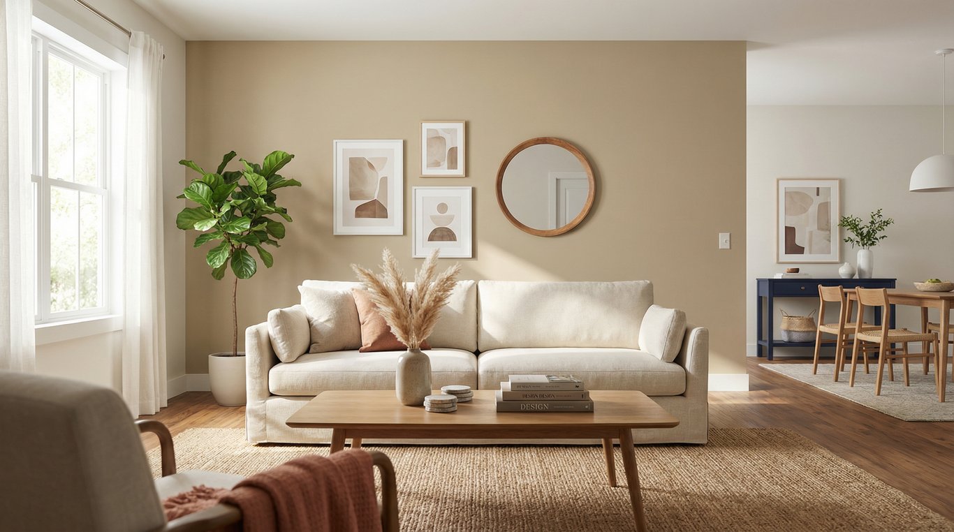
Living rooms and family rooms
It works well here because soft furnishings, wood tones, and layered lighting help the color feel intentional rather than flat.
Hallways and open-plan connecting spaces
It can also work well in circulation zones because it bridges warm woods, white trim, and adjacent rooms more easily than cooler neutrals.
Bedrooms and lower-contrast spaces
In bedrooms, Universal Khaki often reads calm and grounded, especially when paired with soft textiles and balanced daylight.
Where it can feel too heavy
Be more careful in very dim rooms, spaces with strongly yellow lighting, or interiors already dominated by warm beige finishes. In those rooms, a lighter neutral may be easier to live with and easier to photograph.
FAQ
What undertone does Sherwin-Williams Universal Khaki have?
Universal Khaki has a warm, earthy undertone that often reads beige/khaki, with occasional subtle yellow or green influence depending on light and nearby finishes.
Is Universal Khaki too dark for a small room?
Not necessarily. In a small room with good daylight and bright trim, it can feel cozy and intentional. In low-light rooms, it may read deeper—test first and consider a lighter alternative if it feels heavy.
What white trim goes with Universal Khaki?
Both crisp whites (for sharper contrast) and soft whites (for a blended look) can work. Choose crisper trim if your floors and lighting are warm, and softer trim if your finishes skew cool.
Does Universal Khaki look yellow or green?
It can look slightly yellow in very warm light or near golden woods, and slightly green/earthy in cooler north light or near cool stone/tile. Sampling in your room is the best way to confirm.
What colors coordinate with Universal Khaki?
Blue, navy, sage/olive, warm creams, and high-contrast black accents coordinate well. For materials, it pairs nicely with oak and walnut and looks polished with black or brass hardware.