Taupe interiors are a reliable staging move when you want a home to feel warm, updated, and broadly appealing without committing to bold color. Done well, taupe reads “neutral” in person and stays consistent from room to room in listing photos.
The challenge is that taupe is undertone-sensitive: the same paint can look cozy in one space and oddly purple, green, or “muddy” in another—especially under mixed lighting and phone cameras.
This guide focuses on real-world staging results: how to choose undertones, how to pair taupe by room, and which combos tend to photograph cleanly.
What is taupe (and why it sells well)?
Taupe is a neutral blend of brown + gray (often with subtle warm or cool undertones) that sits between beige and greige. In staging, it’s used to soften a space, reduce visual distractions, and create a cohesive “move-in ready” backdrop.
Taupe vs beige vs greige (quick definitions)
- Beige: typically warmer and more yellow/cream-leaning; can read dated if too saturated.
- Greige: gray + beige; often cooler/cleaner, sometimes reads flat in low light.
- Taupe: brown + gray; tends to feel grounded and upscale when the undertone is controlled.
If you’re trying to appeal to the widest buyer pool, taupe interiors often hit the sweet spot: warmer than a cool gray, less yellow than many beiges.
Why taupe photographs better than stark white in many homes
Stark white walls can look:
- Overexposed near bright windows
- Patchy or shadowy in corners
- Harsh next to warm floors or cabinets
Taupe is more forgiving: it holds midtones better, reduces glare, and can make trim and furnishings read cleaner. The key is choosing a taupe that doesn’t shift dramatically under your home’s lighting.
Undertones that matter: warm, cool, and ‘muddy’ taupe
Undertone control is the difference between “elevated neutral” and “why does this look purple?”
How to spot undertones in natural vs artificial light
Use this quick process before committing:
- Check in morning, midday, and evening. Taupe can warm up at sunrise/sunset and cool down at midday.
- Compare against a true white paper (printer paper works). If the taupe suddenly looks pink, green, or violet next to white, that’s an undertone warning.
- Stand in the doorway and look in. Undertones are easier to see from a distance than up close.
- Test under the bulbs you’ll photograph with. Warm bulbs (2700K) amplify yellow/red; cooler bulbs (4000K) can emphasize green/gray.
Practical staging note: if you can’t replace all bulbs, at least keep each room consistent (same color temperature within the room).
Common mistakes that make taupe look purple/green
- Mixing light temperatures (daylight LED + warm lamp) in the same shot.
- Sampling only on one wall. Corner shadows and opposite walls can shift the read.
- Skipping the “fixed elements” check: carpets, tile, countertops, brick, and wood floors can reflect color.
- Over-graying a taupe in a low-light room, which can push it toward a lifeless, muddy gray-brown.
If you’ve ever seen a taupe swing lavender in photos, it’s usually the combo of cool light + reflective surfaces + a taupe with a violet undertone.
Room-by-room taupe ideas for staging
Taupe interiors work best when you treat them like a backdrop: cohesive, calm, and supported by simple shapes and textures.
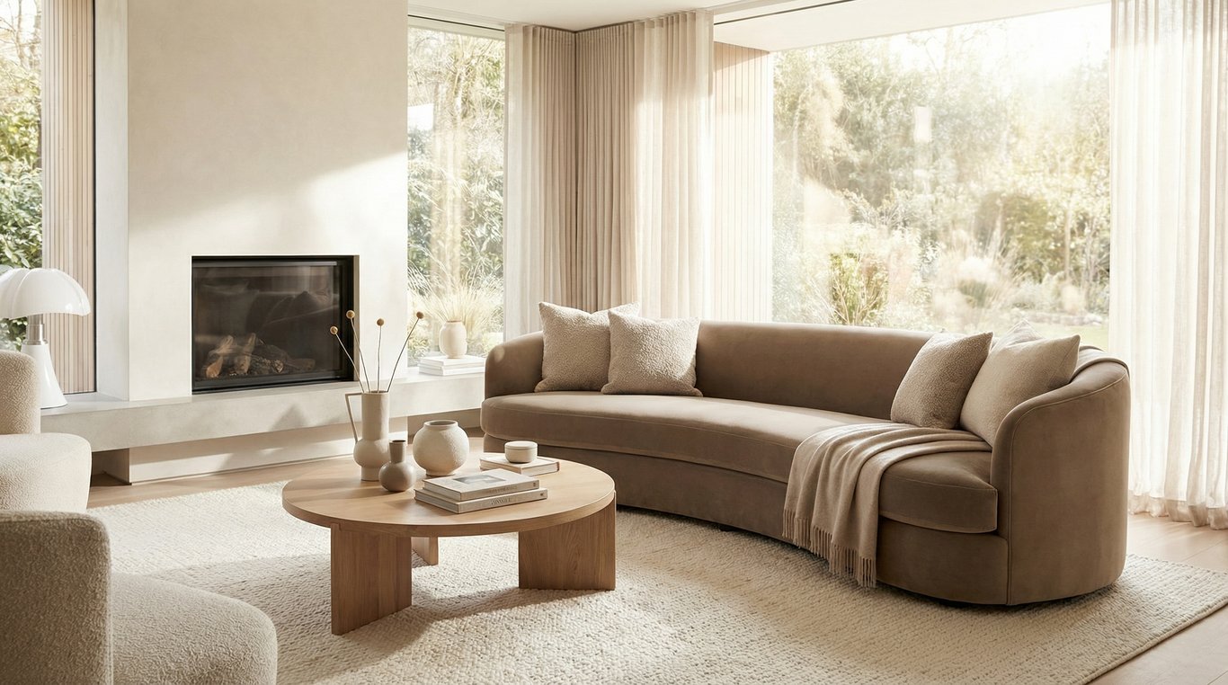
Living room: taupe walls + light textiles
A photo-friendly living room recipe:
- Walls: mid-light taupe (avoid deep taupe unless the room is bright)
- Textiles: off-white/ivory rug, light linen curtains
- Upholstery: warm neutral (cream, oatmeal) with a few darker pillows for contrast
- Metals: matte black or aged brass—pick one direction and stick to it
Keep styling streamlined so the wall color reads intentional rather than “brown.” This is a great place to lean into clean, minimal styling so the photos feel modern.
Bedrooms: taupe + soft contrast bedding
Bedrooms photograph best when the contrast is soft:
- Bedding: white or ivory duvet + taupe/stone throw
- Headboard: warm wood, upholstered oatmeal, or simple black metal
- Art: low-saturation prints (avoid bright blue/green that can push taupe in the opposite direction)
If you want a hotel-like look, keep patterns large-scale and subtle. Tiny busy prints can make taupe feel dingy in photos.
Kitchens/baths: when taupe works (and when it doesn’t)
Taupe can work in kitchens and baths, but be selective.
Works well when:
- Cabinets are white, warm wood, or a quiet neutral
- Countertops are white quartz, light stone, or neutral laminate
- The room has good lighting and minimal visual clutter
Avoid (or use with caution) when:
- You have pinkish beige tile and taupe has a rosy undertone (can look dated)
- You have cool gray tile and taupe is very warm (can clash)
- The space is windowless with warm bulbs (taupe can skew yellow/brown)
Staging workaround: keep taupe on adjacent walls/hallways and use a cleaner off-white in the smallest wet rooms if undertones are fighting the fixed finishes.
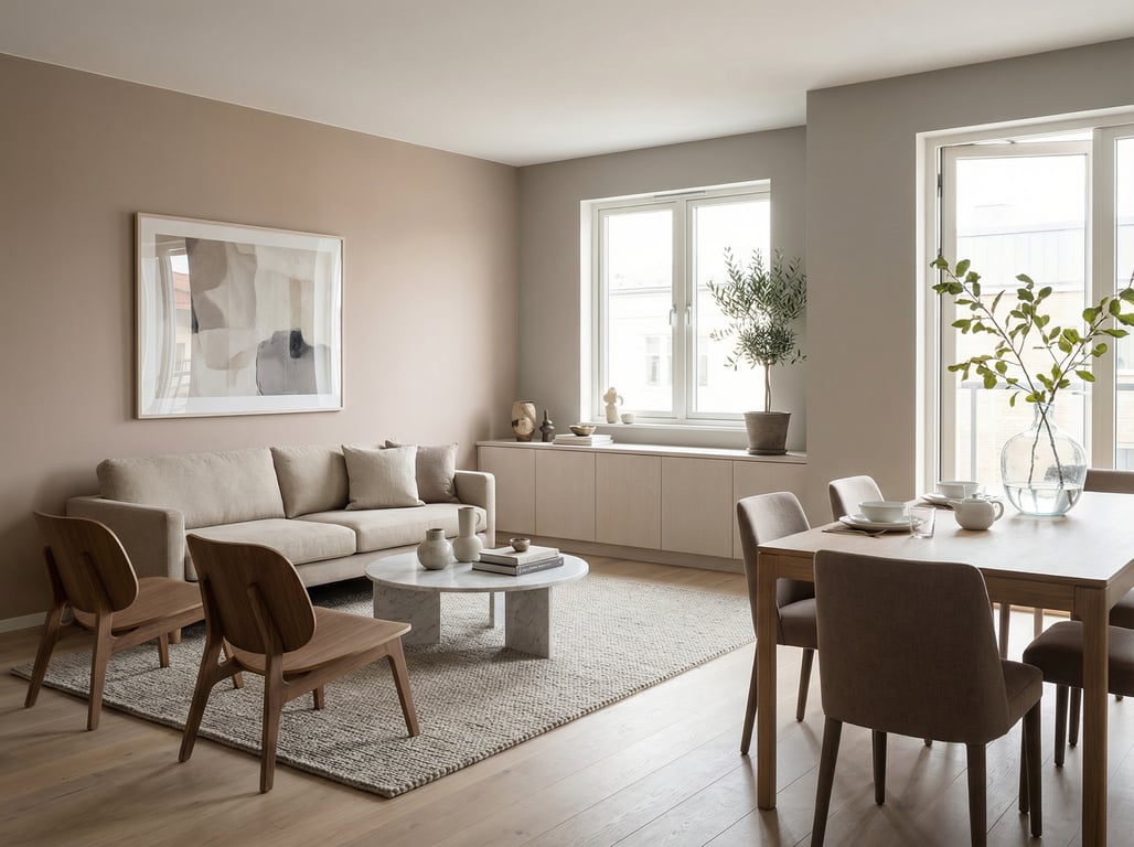
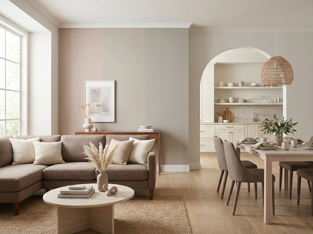
Taupe color pairings that look great in listing photos
The most “buyer-proof” taupe interiors use straightforward pairings that stay stable across camera sensors.
Taupe + matte black accents
Matte black helps taupe read modern and crisp. Use it in:
- Lighting fixtures
- Door hardware
- Curtain rods
- Framed mirrors
Tip: repeat the black accent 3–5 times across the main floor so it looks intentional in wide shots.
Taupe + warm wood
Warm wood (oak, walnut, acacia) adds depth without turning taupe too brown.
- If floors are warm: choose a more balanced/gray-leaning taupe to avoid “all brown.”
- If floors are cool: choose a warmer taupe to keep the space from feeling cold.
Keep wood tones consistent in the photos (don’t mix espresso + honey oak + red cherry unless you have a plan).
Taupe + off-white trim
Off-white trim is often the easiest way to make taupe look clean.
- Use soft white (not icy blue-white) to avoid a dingy contrast.
- Keep trim consistent across the listing if possible: mismatched whites show up clearly in photos.
If your existing trim is a creamy white, choose a taupe that respects that warmth rather than fighting it.
Choosing a taupe paint color: practical checklist
Test swatches: where to place them
Paint selection lives or dies on testing. Use this staging-friendly approach:
Taupe paint selection checklist
- Paint two coats on two different walls (one bright, one shadowy).
- Include a wall that faces or sits near the largest window.
- View next to flooring, countertops, and any large upholstery staying with the home.
- Check at three times of day and under all room lights.
- Photograph the swatches with your phone in wide and close shots.
If it looks neutral in person but weird in photos, trust the photos—buyers will see the listing online first.
Sheen choices for walls
For most staging:
- Eggshell is the safest all-around choice (wipeable, not too shiny).
- Matte can look premium but may mark easily, especially in high-traffic homes.
- Avoid high sheen on walls; it can create hot spots and glare in listing photos.
Trim/ceiling recommendations
- Ceiling: flat white (or your existing ceiling white) to keep light bounce predictable.
- Trim: satin or semi-gloss in a soft white/off-white for crisp edges.
- If you’re not repainting trim, choose a taupe that harmonizes with the existing trim undertone (cream vs cool white).
Agent tip: keep color consistent across the photo set
If multiple rooms are visible in the same sightline (entry → living → hallway), consistency matters more than finding the “perfect” taupe in each space.
- Use one main taupe for connected areas.
- Use one trim white throughout.
- Keep bulb temperatures consistent room-to-room for showings and photo day.
This reduces visual jumps between images and makes the home feel more cohesive online.
Example: Universal Khaki as a taupe-leaning option (when it fits)
If you’re considering a taupe that leans warm, Universal Khaki is often discussed as a practical staging-friendly neutral. Treat it as one option among many, and test carefully for undertone behavior.
For a deeper dive on that specific shade, see our Universal Khaki (Sherwin-Williams) review.
Where it works best
A warmer, taupe-leaning neutral tends to work best in:
- Homes with warm wood floors or warm cabinetry
- Rooms with north-facing light (which can cool down colors)
- Open areas where you want a welcoming tone without going fully beige
How to avoid the ‘too yellow’ look
- Pair with off-white trim rather than a bright, icy white.
- Use matte black accents to keep the palette grounded.
- Keep warm-toned decor controlled (avoid too many golden or orange accessories).
- Confirm lighting: very warm bulbs can push warm taupes into yellow territory.
Key takeaways
- Keep it broad and avoid becoming a duplicate of the existing Universal Khaki page; treat Universal Khaki as one example, not the focus.
- Emphasize real-estate outcomes: neutralizing, brightening, consistent photo tone across rooms.
- Include a short ‘agent tip’ section: how to keep colors consistent across a listing’s photo set.
FAQ
Is taupe warm or cool?
Taupe can be warm or cool depending on undertones. Always test in your lighting—some taupes read rosy (warm) while others lean green/gray (cool).
Does taupe make rooms look smaller?
A light taupe usually doesn’t. In many homes it can feel softer than stark white and still reflect plenty of light. Dark taupe in a low-light room can feel smaller, so keep depth appropriate to the space.
What trim color goes best with taupe walls?
Soft white/off-white trim is the most reliable pairing. Match the trim’s undertone to the taupe (warm with warm, neutral with neutral) to avoid a dingy contrast.
How do I prevent taupe from looking purple in photos?
Test swatches in multiple spots, avoid mixed bulb temperatures, and photograph the sample in both wide and close shots. If it swings purple under cool light, choose a taupe with less violet undertone or warm up the lighting consistently.