Clean lines interior design describes rooms built around simple silhouettes, low ornamentation, and layouts that feel calm rather than crowded. If you have ever read a listing that promised “clean lines” or tried to decode why one room looks polished while another feels visually noisy, this is the idea at work. The term gets used loosely, but it has a specific meaning: forms are easy to read, spacing feels intentional, and details support the room instead of competing for attention.
That definition matters even more now because homeowners want rooms to do more than look good for a moment. In 2026, the strongest interiors are flexible, easy to maintain, comfortable for daily life, and still appealing in photos. Clean lines help achieve all of that without forcing a home into stark minimalism. A room can be edited and warm at the same time. In fact, that blend of simplicity and softness is exactly why the look has remained relevant while harsher, more sterile versions of modern design have faded.
Clean lines meaning in interior design
At its core, clean lines in interior design means uncomplicated shapes, visual breathing room, and a clear relationship between furniture, finishes, and architecture. You notice the overall form first. Decorative trim, fussy patterns, and layered visual interruptions take a back seat. That does not mean a room must be plain or empty. It means the design is legible.
The idea has gained staying power because of how homes are used today. Open-plan layouts, hybrid work, and smaller urban footprints all make clutter more noticeable. In connected kitchen, dining, and living spaces, visual noise travels fast. Simplified furniture profiles, fewer competing finishes, and stronger alignment make the whole home feel more cohesive. This is one reason clean-lined spaces continue to perform well in both everyday living and resale presentation.
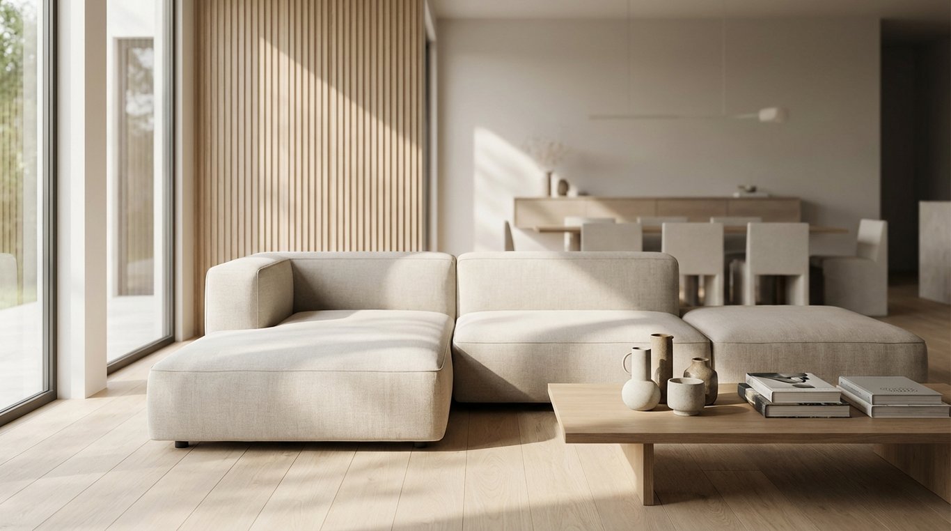
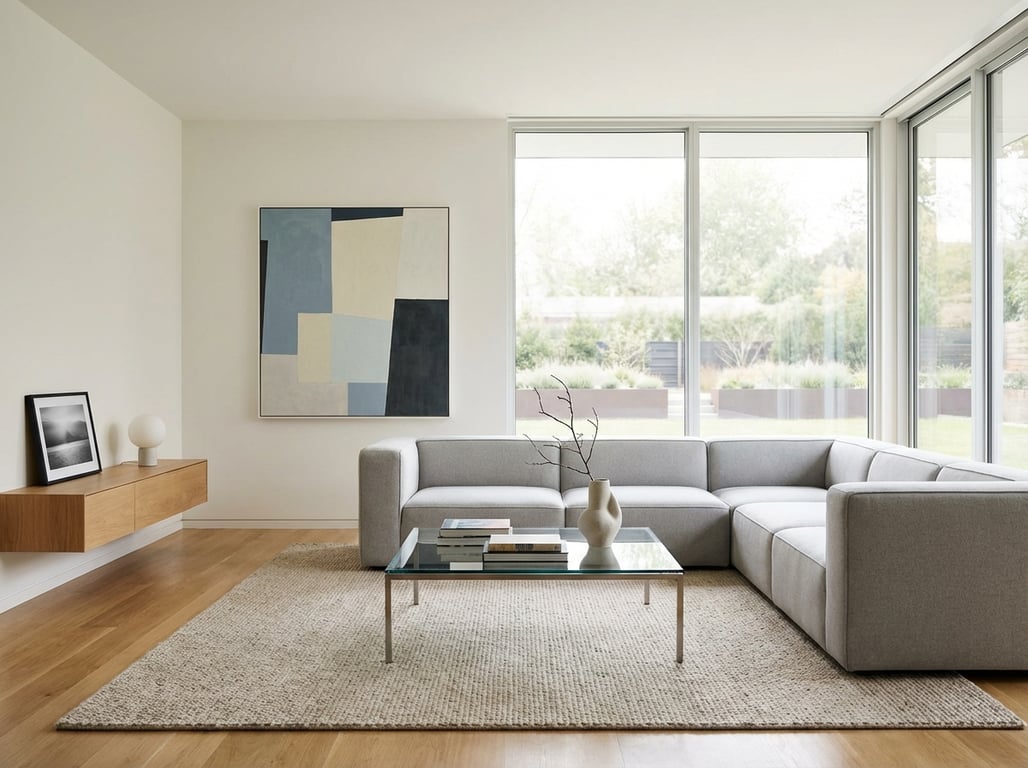
What has changed since the colder minimalist wave of the 2010s is the mood. Current clean-line interiors are softer. Instead of high-gloss white surfaces and sharp chrome, the 2026 version leans toward warm woods, matte finishes, plaster-like textures, muted stone, brushed metal, and upholstery that looks tailored but inviting. The lines stay disciplined, but the atmosphere feels more human.
Designers are also responding to a broader lifestyle shift: people want homes that reduce friction. A room with clear circulation, easier-to-clean surfaces, and fewer visual interruptions feels less mentally taxing. Clean lines fit that brief because they organize what the eye sees before a person even starts using the room.
What clean lines interior design looks like in practice
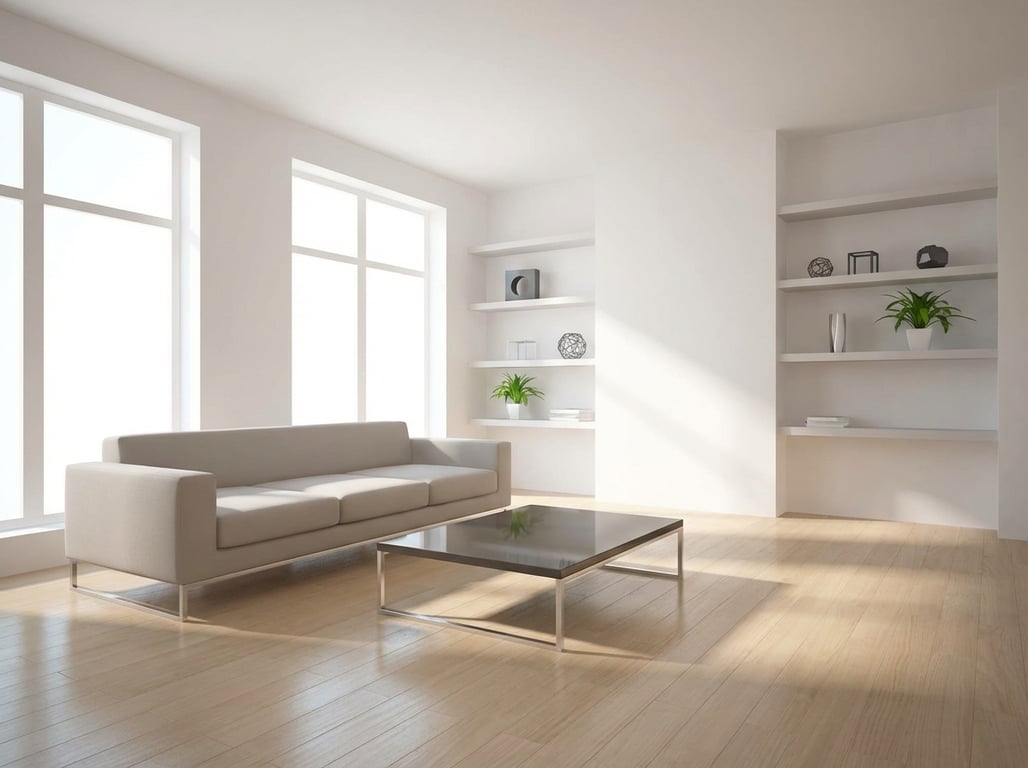
A clean-lined room usually contains a few consistent signals. Furniture silhouettes are edited, with straight or gently curved outlines that are easy to read from across the room. Cabinet fronts are often flat or simply framed. Lighting tends to be sculptural without being ornate. Accessories are present, but there are fewer of them, and they are scaled with more confidence.
Negative space does a lot of work here. When every shelf, wall, and tabletop is full, even beautiful pieces lose impact. In a clean-lined room, there is enough open area around key furniture and decor to let each shape register. That spacing is what gives interiors their calm, intentional quality. It also makes rooms feel larger on camera and easier to understand in person.
Alignment matters too. A rug that properly anchors the seating area, pendants centered over an island, art scaled to the wall, and furniture that relates in height and proportion all reinforce the effect. These moves sound small, but together they create the visual order people often describe as elevated or designer.
The look also depends on restraint in transitions. If every surface changes material, color, or pattern, the room feels fragmented. Clean-line interiors often limit the number of finish shifts within one sightline. For example, a kitchen may repeat one cabinet color, one counter material, and one metal finish so the eye can move easily through the space. That consistency is subtle, but it is a major reason some rooms feel calm while others feel overdesigned.
Clean lines vs minimalism vs contemporary
These labels overlap, but they are not interchangeable. Clean lines describe a visual quality. Minimalism is a broader design philosophy that pushes reduction further and often asks homeowners to live with fewer visible belongings than they want. Contemporary refers to what feels current right now, which changes over time.
That distinction matters because many people say they want a minimalist room when what they actually want is relief from visual chaos. Clean lines provide that relief without demanding an austere lifestyle. You can still have books, textiles, art, and personal objects. The difference is that they are edited and composed.
A room can also be contemporary without being especially clean-lined. Trend-driven shapes, statement stone, dramatic lighting, and bold mixed materials may be current, but if too many of them compete at once, the result feels busy. The best contemporary rooms often borrow the discipline of clean lines, then layer in warmth and personality with restraint.
For real-estate professionals, this distinction is especially useful when talking with sellers. A homeowner who fears minimalism may resist staging changes because they imagine a cold, empty look. Framing the goal as clean lines is more accurate and usually more persuasive. It suggests clarity, flow, and broader buyer appeal rather than deprivation.
Furniture and decor: what “clean lines” really means
In furniture, clean lines usually mean the outline does the heavy lifting. A sofa with track arms, a bench seat, and a tailored profile reads as clean-lined because the eye sees the shape before the details. A dining table with a simple top and uncomplicated base does the same. Flat-front cabinets, low-profile beds, slab-front nightstands, and streamlined lounge chairs all fit naturally into this language.
By contrast, carved trim, heavy tufting, turned legs, ornate molding, and dense decorative hardware move a room away from clean lines. None of those features are inherently bad; they simply communicate a different style vocabulary. What matters is consistency. A room can mix styles successfully, but if every piece speaks a different visual language, the space loses clarity.
One of the biggest market shifts in 2025 and 2026 is that clean-lined furniture has become noticeably more livable. There is more depth in seating, more rounded corners for safety and softness, and more tactile upholstery. Buyers no longer have to choose between a crisp silhouette and actual comfort. That evolution is one reason the style remains strong in residential design instead of feeling like a showroom look.
Decor follows the same rule. Large-scale art often works better than many small frames. One substantial lamp can anchor a console more effectively than several tiny accessories. Drapery hung high and wide reads cleaner than short, under-scaled panels. Even hardware choices matter: slimmer pulls, fewer ornamental backplates, and consistent metal finishes help maintain a cohesive visual rhythm.
2026 room examples and emerging directions
The freshest clean-line interiors in 2026 are not empty white boxes. They tend to share a few updated traits. Palettes are warmer and more grounded: chalky whites, mushroom, sand, muted olive, brown-black, and soft clay are replacing stark contrast. Materials have more texture too. Honed stone, limewash-style paint, ribbed glass, wool, oak, and handmade ceramics add depth without adding clutter.
In living rooms, the look often appears as one strong sofa, one or two sculptural accent chairs, a substantial rug, and a coffee table with a confident geometric form. Gallery walls are giving way to fewer, larger works. Open shelving is being styled more sparingly, or replaced with closed storage altogether. Media consoles remain low and simple, with cable management hidden to preserve visual calm.
Bedrooms are moving toward hotel-like simplicity without losing warmth. Upholstered or wood beds with quiet profiles, integrated sconces, tonal bedding, and minimal but intentional nightstand styling create the effect. More homeowners are also prioritizing concealed storage so the room stays visually restful. That matters because sleep-focused design continues to influence residential choices in 2026, especially in primary suites.
Kitchens remain one of the easiest places to see clean lines. Flat-panel or restrained Shaker cabinetry, uninterrupted countertop runs, fewer upper cabinets, and integrated appliances all support the look. A recent shift is away from overly busy veining and toward quieter surfaces that let shape and proportion stand out. In dining areas, chairs with simple backs and tables with solid, uncomplicated bases help spaces feel grounded rather than over-styled.
Bathrooms are also reflecting the trend. Floating vanities, slab or large-format tile, slim-framed mirrors, and fewer competing metal finishes create a polished effect. In entryways, a single bench, closed shoe storage, and one strong mirror or art piece often work better than a cluster of small decorative items. Across rooms, the update is consistent: less visual chatter, more tactile warmth, and stronger emphasis on function.
Why clean lines work so well in listing photos and staging
For real-estate professionals, clean lines are more than a design trend. They are practical. Rooms with simple silhouettes and reduced clutter read quickly on mobile screens, where buyers make snap judgments. A clear furniture plan also helps viewers understand scale and function faster, which is especially important in smaller homes or awkward layouts.
This style photographs well because it reduces distraction. Clean surfaces reflect light more evenly, fewer accessories create less visual static, and larger, simpler objects hold up better in wide-angle images. Even when a property is not architecturally modern, staging it with cleaner lines broadens appeal. It lets the buyer focus on the room itself rather than the current owner’s decor habits.
That advantage has become more important as listing platforms prioritize stronger lead images and buyers spend more time screening homes online before booking showings. Agents increasingly report that edited, visually coherent rooms generate more saves and more qualified interest than equally nice homes with busier styling. While local market conditions always matter, the underlying principle is stable: clarity improves comprehension, and comprehension improves response.
That is also why small edits before photography can have outsized impact. Reducing countertop items, removing extra dining chairs, simplifying bedding, hiding cords, and consolidating decor into a few larger pieces often improves the photos immediately. The goal is not to erase personality, but to make the room easier to read.
How to get the look without making the room cold
The most common mistake is assuming clean lines require visual deprivation. They do not. The best rooms balance simplicity with tactility. Start with fewer, better-shaped pieces rather than stripping everything away. A strong sofa, a properly scaled rug, and one well-made side table often look better than many smaller pieces trying to fill the room.
Texture is the main tool for warmth. Linen curtains, wool rugs, woven upholstery, natural wood grain, leather, and matte ceramics all soften the precision of the lines. Lighting is equally important. Residential spaces typically feel best in the 2700K to 3000K range, and layered sources such as lamps, sconces, and dimmable overhead lighting prevent the room from feeling flat.
Color also matters. Clean lines do not require all-white interiors. Repeated warm neutrals, earthy greens, dusty blues, soft charcoals, and brown-based accents can make a room feel grounded while keeping the design controlled. Repetition is more important than strict neutrality. When the palette stays disciplined, the eye reads the room as calm.
A useful editing test is to scan for small objects. Many rooms fail not because the main furniture is wrong, but because surfaces are crowded with little items. Replacing several small accessories with one larger vase, bowl, lamp, or piece of art usually improves the space instantly. The goal is not emptiness. It is visual confidence.
Another helpful approach is to prioritize hidden function. A storage ottoman, closed media unit, drawers in a nightstand, or a catchall tray near the entry can preserve the look without making daily life harder. That practical layer is often the difference between a room that looks good for a showing and a room that stays orderly for months.
Common mistakes that weaken clean-line interiors
A frequent problem is poor proportion. Even beautifully simple furniture looks off if the scale is wrong. A tiny rug under substantial seating, undersized bedside tables next to a large bed, or pendants that are too small for the island all disrupt the sense of order. Clean lines depend on balance, so proportion errors stand out more, not less.
Overmixing forms is another issue. One rounded chair can soften a room beautifully, but several unrelated curves layered with sharp corners, ornate details, and trend pieces can make the space feel confused. Clean-lined interiors usually succeed because they repeat a few shapes rather than collecting many.
People also underestimate storage. A clean-lined room is hard to maintain if daily necessities have nowhere to go. Closed storage, concealed charging, organized entry drop zones, and disciplined shelving are what allow the look to function in real life. Without that practical layer, the room photographs well for a day and then slides back into visual clutter.
There is also a common finish mistake: using too many statement materials in one room. Strong veining, busy rugs, dramatic light fixtures, bold hardware, and high-contrast fabrics can each work on their own, but together they dilute the effect. Clean lines benefit from hierarchy. Let one or two elements lead, and allow the rest of the room to support them.
Finally, some rooms miss because they are technically streamlined but emotionally flat. If everything is hard-edged, cool-toned, and smooth, the space can feel impersonal. A successful clean-line interior usually includes a counterbalance such as wood grain, soft upholstery, plaster texture, or warm lighting. Precision looks best when it is paired with comfort.
FAQ
What does clean lines interior design mean?
It means a room uses simple, readable forms with minimal ornamentation, clear spacing, and restrained styling. The effect is calm, intentional, and visually uncluttered rather than busy.
Is clean lines interior design the same as minimalism?
No. Minimalism is a stricter philosophy centered on reducing possessions and visual information to essentials. Clean lines describe a look. A room can have clean lines and still feel warm, layered, and lived in.
Can traditional homes use clean lines interior design?
Yes. Traditional architecture and clean-lined furnishings can work very well together. Original trim, classic windows, or older millwork can stay in place while furniture, lighting, and styling bring more visual clarity. This mix often feels more timeless than trying to force a historic home into a fully modern identity.
Are curved pieces still considered clean-lined?
They can be. Clean lines are not limited to straight edges. Smooth, continuous curves with little ornamentation often fit perfectly, especially in warmer modern interiors. The issue is not whether a piece is curved, but whether its shape is clear and disciplined.
Why do clean-lined rooms perform well in listings?
Because they photograph clearly, feel larger, and help buyers understand the function of a space quickly. Reduced clutter and stronger silhouettes make rooms easier to read on mobile and in person.
What is the fastest way to update a room toward clean lines?
Usually it is editing, not replacing everything. Remove undersized decor, simplify visible storage, hide cords, reduce competing finishes, and make sure major furniture pieces are properly scaled. Those changes often shift the room significantly before any major purchase is made.
Clean lines interior design is ultimately about clarity, not severity. When shapes are edited, spacing is intentional, and materials add warmth, a home feels calmer, more current, and easier to live in. That is why the style continues to hold value in 2026: it works for real life, and it works for the market.