A split level house interior can feel “busy” at first glance: half-flights of stairs, multiple sightlines, and rooms that don’t reveal themselves in one clean sweep. The good news is that the same layout quirks that confuse buyers can often be fixed with a few highly visible, before/after upgrades.
This guide focuses on perception-changing improvements—stair and railing updates, lighting consistency, flooring continuity, and entry tweaks—plus staging tactics that make listing photos easier to understand.
If you want a broader hub of inspiration beyond the before/after angle, start with our guide to split-level house interior ideas.
Key takeaways
- Differentiate from existing ‘split-level-house-interior-ideas’ by emphasizing before/after transformations and listing-photo strategy.
- Tie to the product context lightly: discuss renovation visualization as a way to plan changes (no forced app tutorial).
- Use clear subheadings that match ‘before/after’ intent to win snippets.
Split-level vs tri-level: quick refresher
Definitions
A split-level home typically has three main zones connected by short stair runs: an entry on the “middle” level, with stairs going up to main living spaces and down to a lower level.
A tri-level is a specific subtype where those three zones are distinct, often with:
- Upper: bedrooms
- Main: kitchen/dining/living
- Lower: family room/bonus room (sometimes partially below grade)
If you’re comparing layouts or writing a listing description, it helps to be precise. For a deeper breakdown, see what is a tri-level home.
Why buyers react differently to each layout
Buyers tend to respond to these layouts based on two things:
- Wayfinding: Can they understand where they are and where they’re going within 5–10 seconds of entering?
- Light + ceiling height: Lower levels that feel dim or low read as “basement,” even when they function as living space.
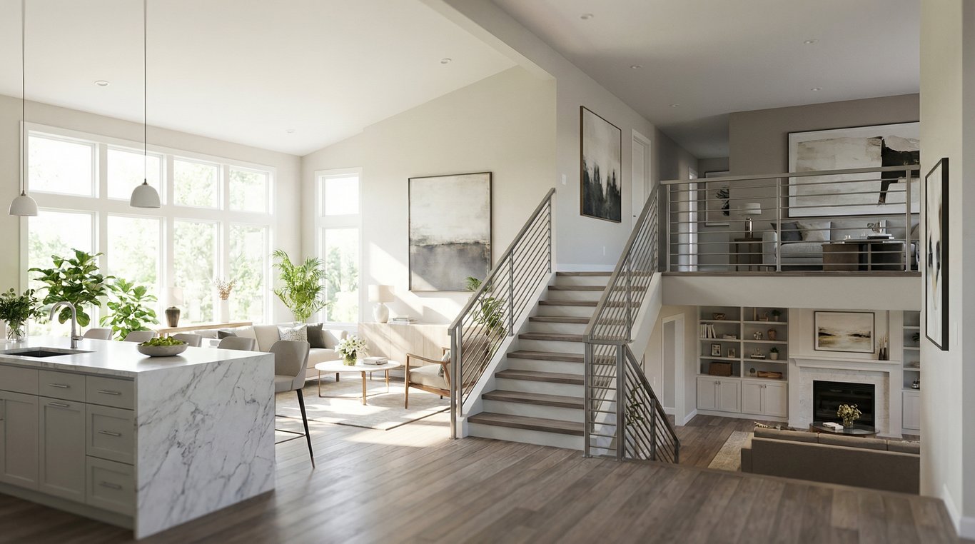
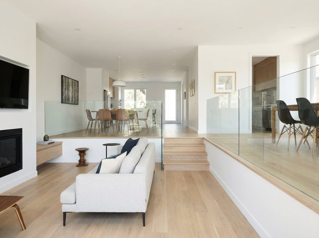
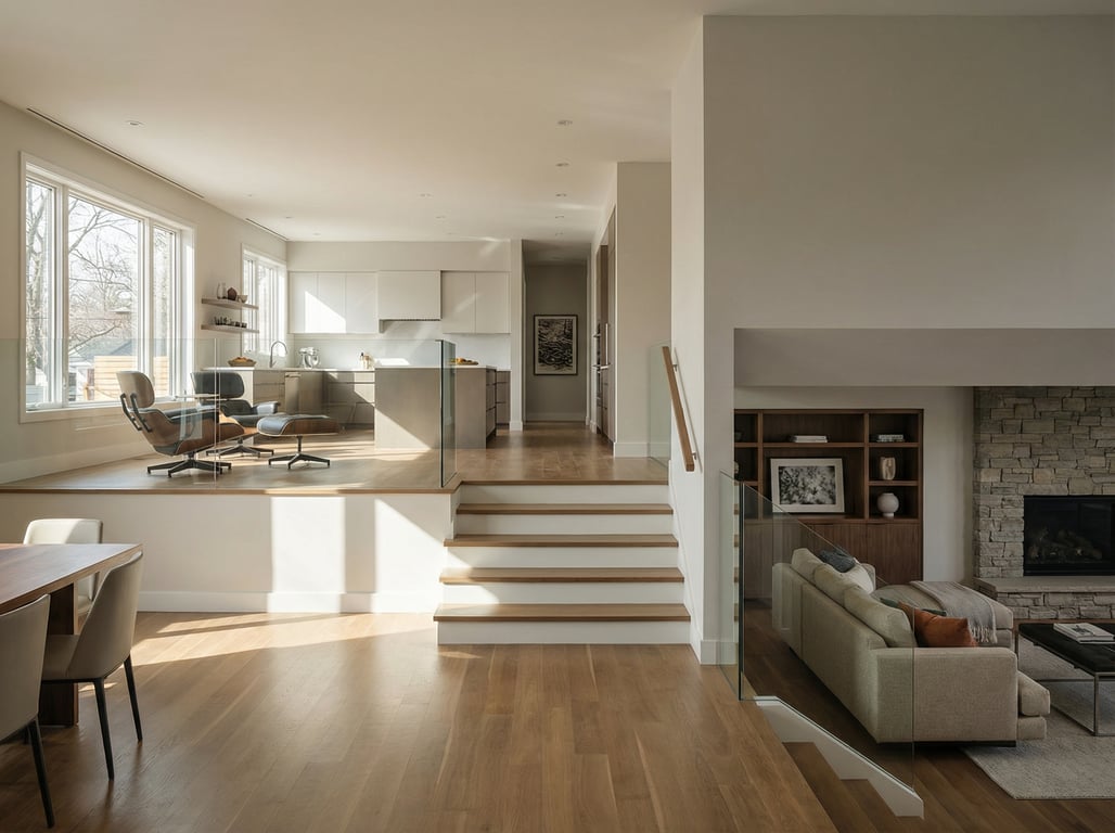
In a split level house interior, the entry and stair geometry often create instant judgment. Your goal with renovations (and staging) is to reduce visual friction: fewer competing focal points, clearer paths, and consistent finishes.
Common split-level interior pain points (and what to fix first)
Choppy entry + stairs
What it feels like (before): You open the door and immediately face a stair split, a railing, and multiple rooms peeking from different angles. It’s not “small,” but it can feel cluttered.
Fix first:
- Simplify the first view: clean railing lines, fewer contrasting materials, a single focal point (mirror, art, or statement light).
- Improve stair presence: modern balusters, cleaner stringers, and consistent stain/paint.
Low light in lower level
What it feels like (before): The lower level reads as a basement because light levels and bulb color temperature don’t match the main level.
Fix first:
- Add layered lighting (ambient + task + accent) and keep color temperature consistent (generally 2700K–3000K for warm-white).
- Use larger, brighter wall colors and reflective surfaces (mirrors, lighter rugs, satin paint).
Awkward sightlines
What it feels like (before): From the entry you might see into a half bath, a laundry door, a low ceiling soffit, or the back of a sofa.
Fix first:
- Redirect attention: add a console + lamp, an entry runner, or a vertical feature (slatted wall, tall plant).
- Create “soft separations” with furniture placement instead of adding walls.
Before/after upgrade ideas that change perception fast
Open up railings and improve stair design
Before: thick half walls, dated spindles, mismatched handrails, or carpeted stairs that visually chop the space.
After (high impact):
- Swap bulky half walls for open railings (wood + metal, or simple square balusters).
- Update the handrail profile and stain/paint for contrast that matches flooring.
- Consider stair treads/risers refinished or replaced for a cleaner “spine” through the home.
Decision tip: If your entry is tight, prioritize visual openness (open railing) over adding decor.
Lighting plan: recessed, sconces, temperature consistency
A split-level looks best when lighting feels intentional across levels.
Before: one ceiling fixture at the entry, a floor lamp in the living room, and dim bulbs downstairs.
After (repeatable plan):
- Entry: a statement semi-flush or pendant (scale matters)
- Stairs: sconces or recessed lights aimed to wash walls
- Main living: recessed + floor/table lamps for warmth
- Lower level: add perimeter lights and one “anchor” fixture to avoid cave vibes
Quick spec rule: Use the same bulb temperature across connected sightlines (e.g., entry → living → kitchen). Mixed temperatures are a subtle but common reason spaces feel “off.”
Flooring continuity across levels
Floor transitions are one of the biggest before/after perception shifts.
Before: tile at entry, different hardwood in living, another surface in kitchen, carpet on stairs, different carpet downstairs.
After options:
- Run one continuous hard surface across entry/main level where possible.
- Keep stairs consistent with the main floor (matching stain or complementary tone).
- Use the same or coordinated flooring in the lower level (LVP can work well if chosen carefully).
Real-world compromise: If you can’t replace everything, match undertones (warm vs cool) and reduce the number of transitions visible from the entry.
Entry refresh: storage, mirrors, paint
Before: no landing zone, shoes in the walkway, and a blank wall that makes the space feel unfinished.
After:
- Add a slim console or wall-mounted shelf + catch-all tray
- Install hooks or a closed shoe cabinet if the entry is narrow
- Use a large mirror to bounce light and widen the first impression
- Paint strategy: keep the entry and stairwell the same light neutral to visually connect levels
Planning help: If you’re unsure what walls connect what spaces, start by understanding the structure and flow—especially if you’re considering removing half walls or changing stairs. Tools and records can help you find floor plans by address before committing to demo.
Before vs after checklist (fast wins)
| Area | “Before” signals | “After” upgrade that reads instantly |
|---|---|---|
| Entry | clutter, no landing zone | console + mirror + closed storage |
| Stairs | dated railing, busy lines | open railing + updated handrail |
| Lighting | mixed color temps, dark lower level | consistent bulbs + layered lighting |
| Floors | many transitions, mismatched tones | fewer transitions + matched undertones |
| Sightlines | see utility doors/backs of furniture | add focal point + adjust furniture zoning |
Room-by-room ideas
Living room: unify with rug + furniture zoning
Split levels often have living rooms that are open to the entry or visually connected by a half flight of stairs. Make it read as one intentional “zone.”
- Use a large rug to anchor seating (front legs of sofa/chairs on the rug).
- Float furniture to create a clear walkway from entry to kitchen/dining.
- Choose one focal wall (fireplace, media, or art) and angle seating toward it to avoid “furniture backs” as the first view.
Kitchen/dining: improving flow and sightlines
Common issue: kitchen feels separated, but not private—so it shows clutter.
- Add a consistent backsplash and under-cabinet lighting to brighten the workspace.
- If a peninsula blocks views, consider a slimmer profile or a contrasting countertop edge that feels lighter.
- Use matching bar stools and one simple centerpiece to reduce visual noise in photos.
Lower level: making it feel like ‘bonus space’ not ‘basement’
The fastest perception shift is to give the lower level a clear purpose.
- Define the function: media room, office, gym, playroom, guest suite.
- Add a “ceiling-friendly” lighting plan: recessed + wall sconces instead of a single center light.
- Use warmer textiles (area rug, curtains) and taller elements (bookcase, floor lamp) to counteract lower ceiling height.
How to stage a split-level for listing photos
Photo sequence to reduce confusion
A split-level is harder to understand in a swipe-through carousel. Use a sequence that teaches the layout.
Recommended photo order:
- Entry (show both stair directions if possible)
- Main living area wide shot
- Kitchen
- Dining
- Primary bedroom
- Secondary bedrooms
- Lower level wide shot
- Lower level feature (office/media)
- Bathrooms
If you can, include one “connector” shot from the landing that shows where the next level goes.
Declutter the stair/entry line-of-sight
Your first 1–2 photos usually include stairs. Make them clean and graphic.
- Remove shoes, coats, and small mats that break up the floor.
- Keep railing decor minimal (no garlands, signs, or busy baskets).
- Replace mismatched bulbs so light color is consistent in the same frame.
Consistent styling across levels
Consistency is what makes the home feel cohesive rather than chopped up.
- Repeat 1–2 metals (black, brass, chrome) across fixtures and hardware.
- Repeat 1–2 woods/tones across furniture and stair elements.
- Use the same white balance in photography; mixed lighting makes levels feel unrelated.
FAQ
What is the difference between a split-level and a tri-level home?
A split-level usually describes the “staggered floors connected by short stairs” concept broadly. A tri-level is a common three-zone version (upper/main/lower) with distinct living areas on each level.
How do you make a split-level feel more open?
Focus on the first sightline: open or simplify railings, reduce floor transitions, and use consistent lighting color temperature. Then use furniture zoning to create clear walkways and one main focal point.
How should you stage a split-level house for photos?
Use a photo sequence that explains the layout (entry → main level → bedrooms → lower level). Declutter the stair/entry area aggressively, and keep styling consistent across levels so the home reads as one cohesive space.
What upgrades add the most appeal in a split-level?
The highest-impact before/after upgrades are stair/railing modernization, a cohesive lighting plan (especially downstairs), and flooring continuity. Entry storage + a strong focal point also improves first impressions quickly.