An organic modern living room is one of the easiest styles to stage for real estate marketing because it reads clean, calm, and elevated on camera. It’s minimal without feeling stark, and warm without looking busy.
This guide focuses on what helps listings: fewer visual distractions, a neutral-but-inviting palette, and layout choices that make rooms look larger in wide-angle photos.
You’ll get a quick definition, a camera-friendly color guide (including taupe interiors), a furniture and materials checklist, three layouts with dimension notes, and a simple photo checklist you can use on shoot day.
What is organic modern style?
Core traits: warm minimalism + natural textures
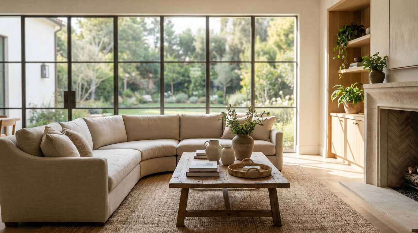
Definition: Organic modern style is modern simplicity softened by natural materials and warm neutrals—think clean shapes, layered textures, and a calm palette that feels lived-in (but not cluttered).
In a living room, that usually looks like:
- Simple silhouettes: low-profile sofa, streamlined media console, minimal leggy accent chairs
- Natural textures: linen, cotton, jute, boucle, light wood, stone or travertine-look surfaces
- Warm neutrals: warm whites, soft greiges, and taupe interiors that photograph as inviting instead of sterile
- Purposeful negative space: fewer objects per surface, with breathing room around furniture
How it differs from modern, Scandinavian, and rustic modern
- Organic modern vs. modern: modern can skew cool (white + gray + chrome). Organic modern keeps the same restraint but adds warmth through wood tones, matte finishes, and texture.
- Organic modern vs. Scandinavian: Scandinavian often feels brighter and lighter with more overt “cozy” cues (light woods, playful accents). Organic modern is typically more tonal and grounded.
- Organic modern vs. rustic modern: rustic modern can lean heavy (reclaimed beams, distressed finishes). Organic modern prefers refined, smoother natural materials and fewer “country” signals.
Why organic modern works for listings (and photos)
Reduces visual clutter
Listing photos reward clarity. Organic modern naturally limits:
- small decor clusters
- high-contrast patterns
- collections on shelves
That means cleaner wide shots and fewer distractions pulling attention away from the room’s size and light.
Neutral-but-warm palette reads well on camera
A warm neutral base avoids the “cold gray” look and helps skin tones and wood tones photograph more naturally. Taupe interiors are especially useful because they:
- hide minor scuffs better than bright white
- add depth without reading dark
- complement both warm and cool flooring
Broad buyer appeal
Organic modern is style-forward but not polarizing. It’s easier for buyers to imagine their own furniture in the space, which is exactly what you want for commercial listing intent.
Organic modern color palette (quick guide)
Warm whites and soft greiges
For photo-friendly walls and large textiles, aim for warm whites and soft greiges (gray-beige). Practical staging rule:
- Keep walls and the largest upholstered piece within one light-to-medium value range to avoid harsh contrast.
If your living room is dim, prioritize lighter warm whites so the room doesn’t photograph muddy.
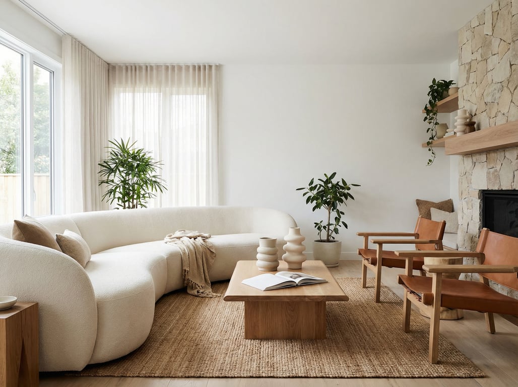
Wood tones (oak/walnut) and matte black accents
A simple, reliable mix that photographs well:
- Light oak (or oak-look) for airy warmth
- Walnut (sparingly) for contrast and depth
- Matte black accents (thin frames, small lamp bases, hardware) to add definition in wide shots
Keep black accents to a few repeat moments (e.g., lamp + frame + coffee table base) so they look intentional.
Avoiding yellow casts in photos
Yellow casts usually come from inconsistent bulbs and mixed color temperatures.
- Use 2700K–3000K LED bulbs across lamps (choose one temperature for the whole room)
- Turn off overhead fixtures if they’re a different temperature than lamps
- If the room has strong warm wood or beige carpet, keep paint and textiles warm-neutral, not creamy-yellow
Furniture & materials checklist
Clean lines furniture (sofas, media consoles)
Choose pieces with simple profiles that don’t visually “shout” in photos:
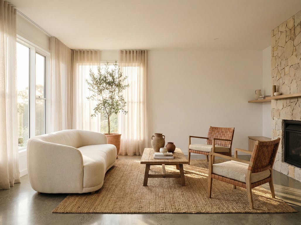
- Sofa: tight back or lightly cushioned, minimal tufting, raised legs or a low plinth
- Coffee table: slim top, rounded corners (safer and softer on camera)
- Media console: long and low, closed storage to hide cords and devices
If you want more guidance on streamlined silhouettes, see this related reference on clean lines interior design.
Natural textures: linen, jute, boucle, travertine look
Organic modern looks best when texture does the work instead of color.
Camera-friendly texture pairings:
- Linen sofa + boucle accent chair (soft variation without pattern noise)
- Jute or wool rug + cotton/linen curtains (adds depth in wide shots)
- Travertine-look coffee table (or a stone tray) for a subtle highlight
Avoid overly nubby textures if you’re photographing close-ups only; in listing photos, mid-scale texture reads better from a distance.
Metals: matte black, brushed brass (sparingly)
- Use matte black as the primary metal for consistency.
- Add brushed brass only in small doses (one or two items) to avoid a mixed-metal look that reads “busy”.
3 organic modern living room layouts (with dimensions to consider)
Small living room: floating sofa + slim coffee table
Goal: make the room feel wider and improve photo angles.
- Float the sofa 3–8 inches off the wall (even a tiny gap creates depth)
- Use a slim coffee table (12–16" deep) or an oval to improve walk paths
- Keep 30–36" clear for main circulation paths; 18" between sofa and coffee table
Text diagram (top view):
- Wall/TV
[media console]- ` [chair] (rug) [sofa] [table]
`
Shoot tip: photograph from the corner that shows the most floor area between rug edge and wall.
Open-concept: zoning with rug + console table
Goal: define the living room in one frame without it blending into dining/kitchen.
- Use a rug large enough that at least the front legs of all seating sit on it
- Place a console table behind the sofa to create a “back edge” and a styling zone (lamp + tray)
- Keep one consistent palette across zones (repeat wood tone or black metal)
If your home has unique flow constraints (like staggered levels), adapt these zoning moves to the architecture—this roundup of split-level house interior ideas can help you plan transitions and sightlines.
Large room: conversation grouping + secondary seating
Goal: prevent the room from looking empty in wide shots.
- Create a main conversation group (sofa + 2 chairs) anchored by a rug
- Add a secondary moment: reading chair + floor lamp + small side table
- Use a larger coffee table or two nesting tables so the center doesn’t look bare
Dimension cues:
- Aim for 8' x 10' or 9' x 12' rugs for most large living rooms (larger if you can)
- Keep seating within 8–10 feet across so it reads as a cohesive group in photos
Before/after-friendly upgrades (high impact, low effort)
Lighting: layered lamps + warm bulbs
Fastest upgrade for better listing photos:
- One table lamp + one floor lamp (two heights) instead of relying on overhead lighting
- Use matching bulb temperature (2700K–3000K)
- Add a shade that diffuses light (linen shades photograph softly)
Rug sizing and placement
Common “before” problem: a rug that’s too small makes the room feel cramped.
Staging rules that photograph well:
- Rug should extend at least 6–12" beyond the sofa on each side (as space allows)
- Front legs of sofa and chairs on the rug
- Keep rug centered on the conversation area, not the room perimeter
Curtain height tricks
To make ceilings look taller:
- Hang rods 2–4" below the ceiling (or crown)
- Extend rods 6–12" wider than the window on each side
- Use curtains that just kiss the floor (avoid puddling for listings)
Common mistakes that make it look ‘cold’ or ‘messy’
Too many textures/patterns
Organic modern relies on restraint. Too many patterns can create “visual noise” in wide-angle shots.
Fix:
- Keep patterns to one (a subtle pillow or throw)
- Let texture come from solids: linen, boucle, jute, matte ceramics
Wrong wood mixes
Mixing wood is fine; mixing undertones is the issue.
Fix:
- Pick one dominant wood tone (often oak)
- Add one supporting tone (walnut or black)
- Avoid three+ competing woods in the same sightline (coffee table + console + frames)
Over-accessorizing shelves
Shelves can instantly read cluttered on camera.
Fix (simple shelf formula):
- Leave 30–40% empty space
- Use 3–5 larger objects instead of many small ones
- Hide cords, remotes, and device lights before shooting
Photo checklist (do this right before you shoot)
Organic modern living room checklist (camera-first):
- Remove: pet beds, extra throws, stacks of mail, kid toys, appliance chargers
- Straighten: rug edges, curtain panels, pillow seams and tags
- Simplify surfaces: coffee table gets one tray + one book + one vase (or similar)
- Light: turn on lamps, match bulb temperatures, open blinds evenly
- Angles: shoot from the doorway corner first; keep vertical lines straight; show two walls when possible
Key takeaways
- Keep the advice framed around listing presentation: declutter, light, neutral warmth.
- Include a small ‘photo checklist’ (angles, lighting, what to remove) to align with property marketing intent.
- Avoid duplicating the existing ‘clean lines interior design’ article; reference it via internal link instead.
FAQ
What colors are organic modern?
Organic modern colors are warm neutrals: warm whites, soft greiges, taupes, muted sand tones, and natural wood, with small matte black accents for contrast.
What is the difference between organic modern and modern?
Modern is often cooler and more stark (crisp whites, grays, chrome). Organic modern keeps modern simplicity but adds warmth through wood tones, soft neutrals, and natural textures.
What type of sofa fits organic modern style?
Choose a simple, low-profile sofa with clean lines, neutral upholstery (linen-look, performance fabric), and minimal tufting. Raised legs or a low plinth photographs especially well.
How do I make an organic modern living room feel cozy?
Layer two to three textures (linen + boucle + wool/jute), add warm lighting with lamps (2700K–3000K), and keep decor minimal but substantial (fewer, larger pieces).
If you want to preview furniture layouts and palettes before buying or staging, try a few interior design apps to mock up rug sizes, sofa placement, and tone-on-tone color options.